
Friends,
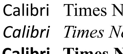
Speaking of fonts (don’t you mean typeface? – ed I would, but this is an old machine and they still call them fonts, so I’m sticking with it.) Are we still talking about serif versus sans serif fonts? I was taught that serif fonts were the most legible and people like them. Then Calibri was adopted for legibility and accessibility by the community, then by the government, which prompted me to download Atkinson Hyperlegible from the Braille Institute. It contains some neat features that make it extremely legible for people with reading disabilities and low vision, and wouldn’t you know that it just so happens to be a sans serif font. I thought, “Yup, I’m all in. Sans Serif is now my thing.”
Then fucking Marco Rubio passed a brain stone and decided that sans serif fonts are too “woke.” Too woke means, of course, that the people with poor eyesight might be able to read things on that the U.S. State Department produces, so the more legible typefaces must be replaced. This is more about clamping down on people who don’t fit their weird ideal. It’s punching down. It’s making life in the United States just a little harder for the most vulnerable.
I hate these people so much.
(hammered out really quickly on 11 December by) your pal,
– bob